As a child I loved doodling stuff into notebooks and writing down my imaginary sports results, entertainment shows, and similar stuff.
But by high school I more or less stopped doing it. I “grew up” you may say.
Fast forward to Summer 2017 and I suddenly got hugely into Japanese “cartoons”. So much that I even felt like drawing again and improving my skills.
I watched various tutorials on how to improve, I practised drawing loads of eyes in different ways.
But most of the tutorial videos reached a similar conclusion – good drawing skills require A LOT of practice.
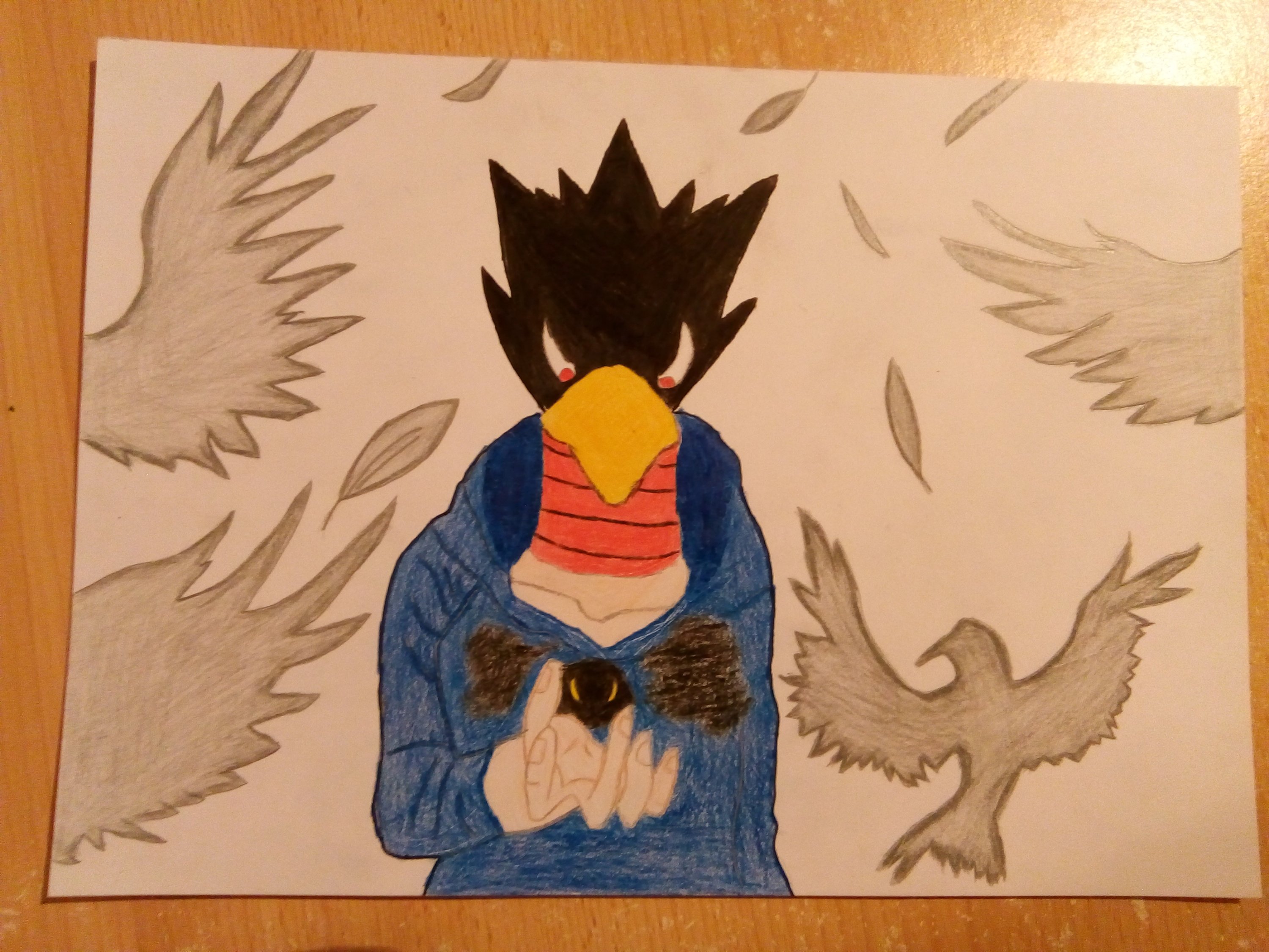
I guess you could only call it a small phase but I did give it a go. It resulted in a Fumikage Tokoyami drawing with some weirdly colored clothes.
I would show it if I had the picture around me right now.
Design theory
But that wasn’t all. The last year of high school was coming and with it the final year for the subject called “design theory” where we… Drew things.
A lot of my drawings ended up being anime related.
I was proud of most of them, despite the fact that it was more or less just traced stuff.
The assigment was to draw five aesthetic principles which were relation, symmetry, balance, domination and contrast.
Every week was spent thinking of a new way to incorporate anime into those aesthetic principles. It was great fun coming up with the ideas, but when I had all the 5 drawings ready, it was hard to actually determine which drawing represented each principle in the best way, since some drawings could easily fall into more categories.
This is my version of the Steins;Gate clocks from the opening, used as “relation”.

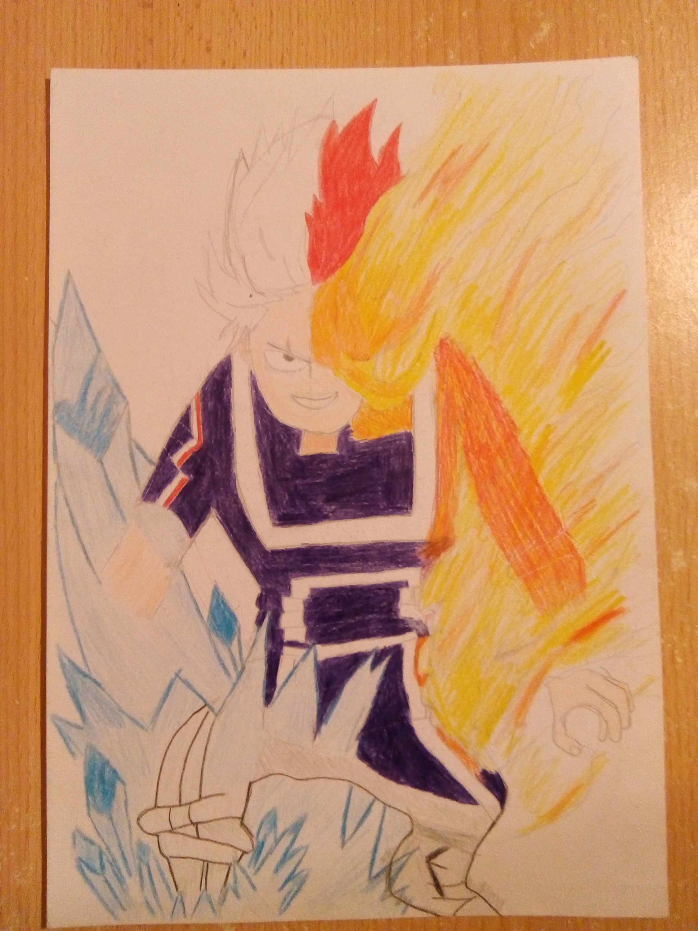
For “contrast” I tried to draw Shoto Todoroki during that certain amazing fight from My Hero Academia season 2.
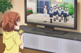
“Balance” or “unity” was this scene from the opening of Girlish Number where the characters unite to make a star with their fingers.

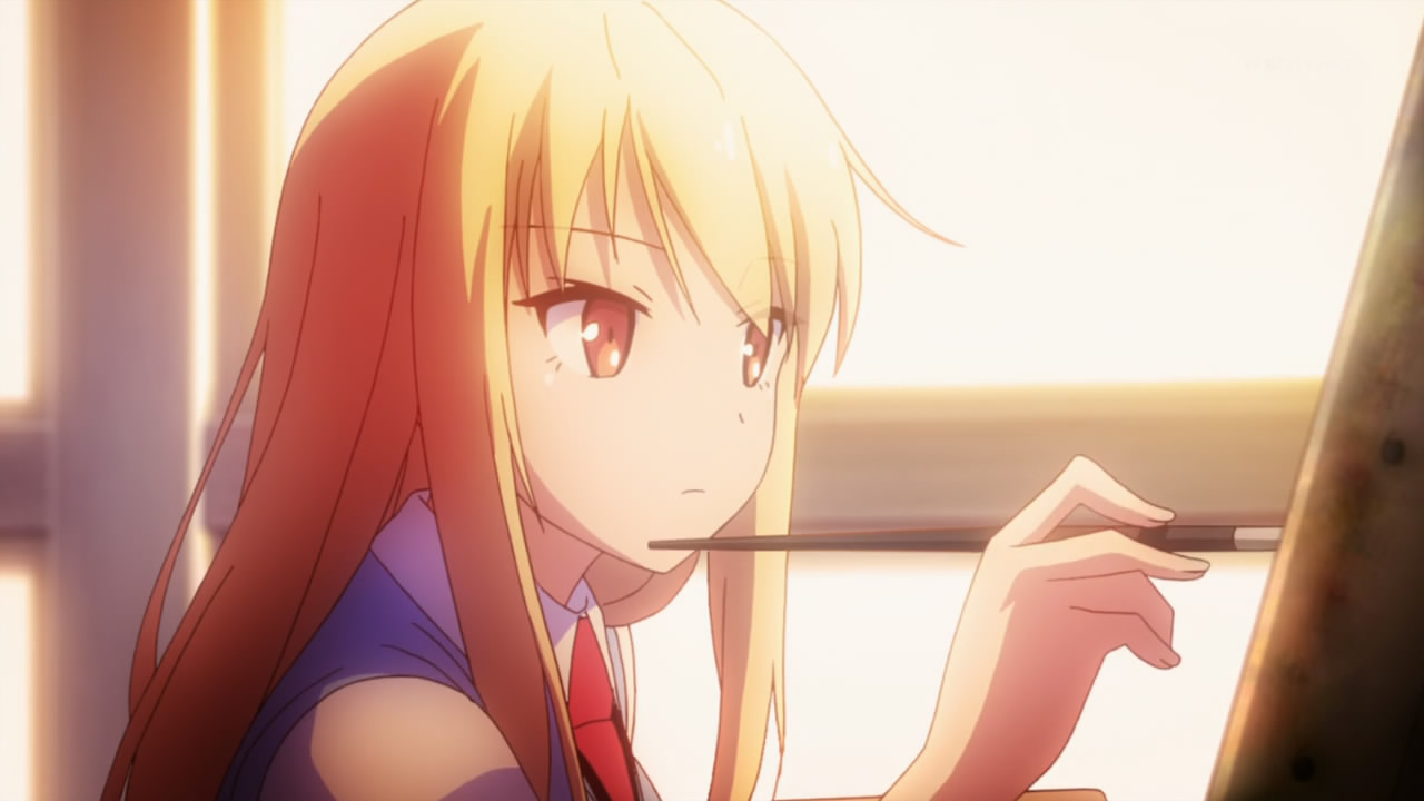
This is a beautiful fanart of Fumikage Tokoyami that I just really wanted to try recreating myself. It was used as “domination”.
At first my idea for “domination” was Shinya Kogami from Psycho-Pass pointing the dominator. I even finished the drawing but wasn’t entirely satisfied with the result and I realized it doesn’t actually fit that well for the intended role.
I can’t seem to find the drawing so I can’t post it here now…
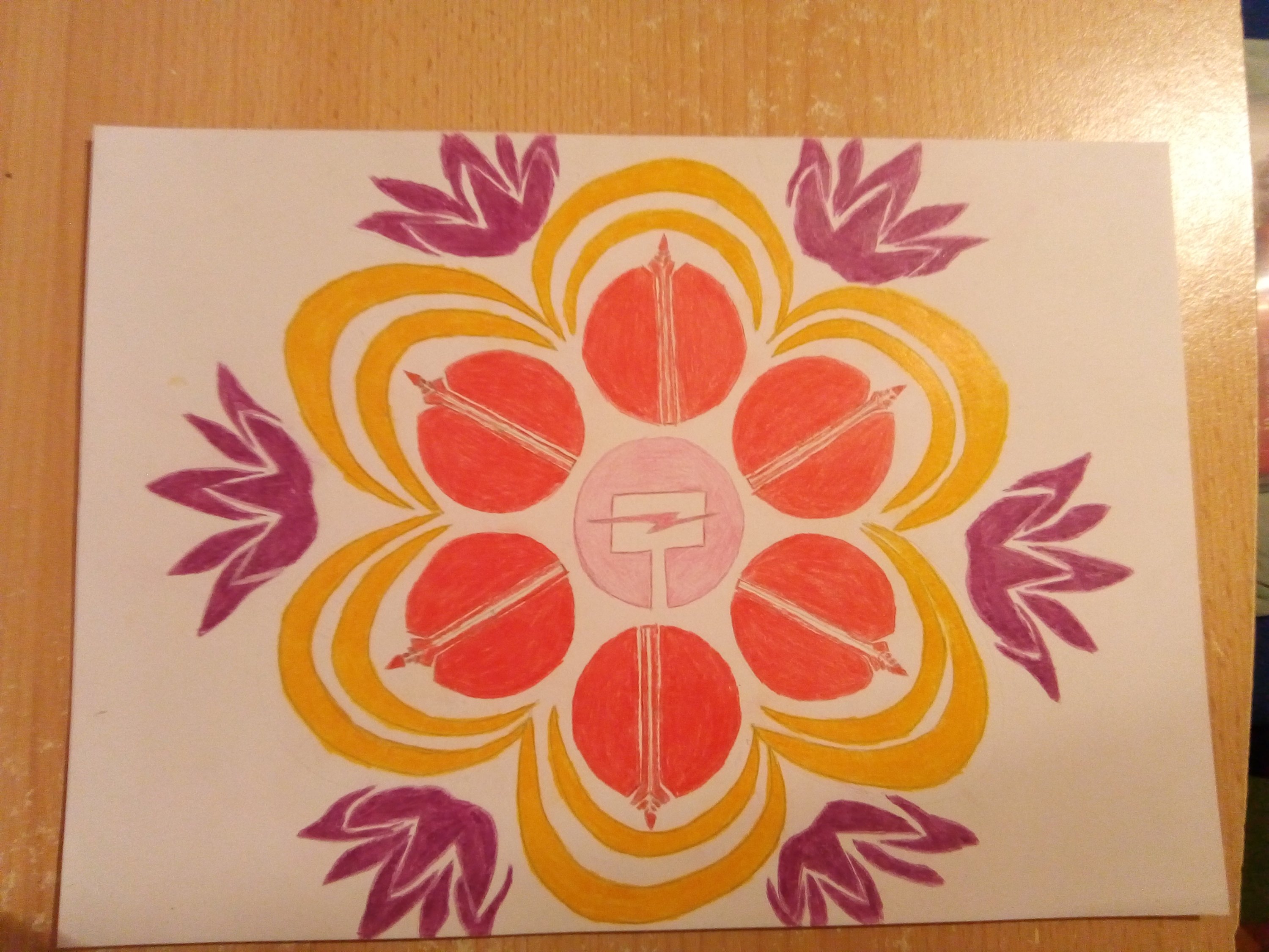
What we have next are the emblems of team JNPR from RWBY arranged into this unity. I first thought it could be used as “unity” but I then realized it could actually serve very well as “symmetry”.
That was all for the aesthetic principles. But it’s not all of the anime inspired stuff…
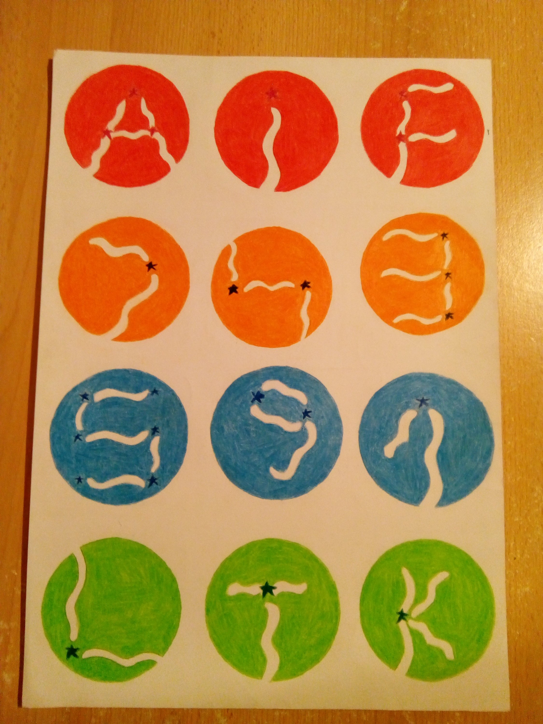
Does the font seem a bit familiar? Well that’s because it was inspired by the Toradora font, and its wavy looking exclamation mark with the star serving as a dot.
This was my work for the “custom font” we had to make.
Not to brag, but all of the things pictured here brought me the highest grade you can get in a Croatian school, and that is 5.
So yeah now you saw my attempts at trying to draw well. If you have similar stories of drawing anime stuff, I would love to read them in the comments!